Why does a maple syrup bottle have a tiny handle?
If you only have time for one sentence:
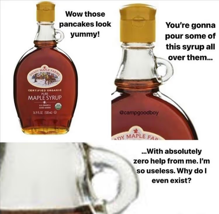
Why does that little handle exist?
I’ve come across this image online several times, and I simply cannot ignore the question: why is that little handle there? What is its purpose?
This is exactly what semiotics is about: interpreting signs.
The tiny handle adds nothing to the practicality of the packaging. The product isn't large or heavy enough to require a separate handle for pouring or carrying. It isn’t "necessary"; it doesn't make usage easier. One might even call it useless. Yet, it is anything but.
If it lacks a practical function, it must be a cultural reference that clearly signifies something. But what?
To find out, we should look for analogies and examples -not just from our contemporary environment, but from the distant past. Let's look at these handled jars, jugs, and amphorae.
.avif)
What values does the little handle represent, and what product attributes are they linked to?
CRAFT, TRADITIONAL, RURAL, AUTHENTIC
It evokes old milk, oil, and honey jugs - creating a handcrafted atmosphere from the era before industrial production. It feels timeless and reliable.
SLOW, RITUALISTIC
The tiny handle signals that the act of pouring has significance. It requires slow, attentive use, distancing the product from the hurried pace of everyday life. Think of a Japanese tea ceremony and the ritualistic nature of pouring. Maple syrup is linked to home-cooked pancakes - an experience we savor - rather than a pastry grabbed during the morning rush.
PREMIUM
It is technically redundant—yet it’s there. It is the result of care and attention. It shows that resources were spent on it (a more expensive manufacturing process), signaling that the packaging isn't about cost minimization.
VALUABLE
Regarding the pouring ritual: a little goes a long way. It suggests a dense, full-bodied, and concentrated content (not thin or watery) that should be used carefully and with control.
Summary:
The tiny handle doesn't add a function to the packaging - it is precisely its lack of function that makes it authentic and premium. If we had to explain it to consumers, it wouldn't work. It’s brilliant because we feel what it means without any mental effort. It is embedded in our collective cultural memory, condensing these meanings so that at a glance, we feel: this is a valuable, artisanal, premium product meant for slow, meaningful meals.
Further takeaway
- Seemingly "unjustified" elements of packaging are only unjustified if they need to be explained. Culturally relevant (= decodable at a glance) non-functional elements are actually signs carrying deep meaning. They are not flaws; they are reminders.
- There are several "useless-looking" general packaging codes similar to the tiny handle that almost automatically create a premium feel - such as embossing, wax seals (or their imitations), strings, and ribbons.
- The premium value is diluted if you try to put "everything and the kitchen sink" on the packaging. It’s better to start from the core values of the category and the brand, then focus and condense. Today, it is especially true that less is more.
.avif)
Cultural traditions and universally known signs and codes provide an excellent starting point for your packaging to communicate values without the need for explanation. When used correctly, these work even if your brand or packaging is modern and innovative.
If you’d like to look at your packaging or products through this lens, feel free to contact me: zsuzsanna.jovan@springresearch.hu and +36 70 311 0111